

-
- Inventory gains continue, but growth is slowing: Active listings rose 17.0% year-over-year, the 23rd consecutive month of gains, but growth has decelerated steadily since May. National inventory remains 13.9% below pre-pandemic levels.
- Regional divide widens: The South and West are now above pre-pandemic inventory, while the Northeast and Midwest remain deeply undersupplied. Metros like Denver and Austin are far ahead of their 2017–2019 norms, while Hartford and Chicago lag furthest behind.
- Time on market extends further: The typical home has spent 62 days on market, a week longer than September of last year. Homes are sitting longest in Florida and Las Vegas, reinforcing the broader cooling trend.
- Prices flatten, with regional declines: The national median list price held steady at $425,000, but dipped 3.6% in the West. On a per-square-foot basis, prices are rising in the Northeast and Midwest, but falling in the South and West, underscoring the divergence across markets.
- Price cuts remain widespread, especially at lower tiers: Nearly 20% of listings saw reductions in September, with sellers between $350,000-$500,000 most likely to cut. In contrast, luxury home sellers remain more patient, with reductions least common at the top of the market. A look at local markets also reveals some metro-level variation in this pattern.
In September, homebuyers saw more options as inventory expanded for the 23rd consecutive month, according to Realtor.com® housing data. The number of homes for sale remained above one million for the fifth month in a row, but the pace of growth has slowed with the summer homebuying season coming to a close. The divide between regions continues to sharpen: metros in the South and West are not only back above pre-2020 inventory levels but are also still adding supply, while the Northeast and Midwest remain structurally undersupplied.
Despite falling mortgage interest rates over the past few months, the housing market’s pace continues to slow. Homes spent longer on the market for the 18th straight month, with the slowdown most pronounced in Florida and the West. List prices nationally were flat year-over-year but slipped in the South and West, with regional differences starker when measured on a per-square-foot basis. Price reductions remain a defining feature of this market—nearly one in five listings nationwide has seen its price cut—and is concentrated among lower-priced homes where sellers are more motivated. The result is a housing market offering buyers more leverage than in recent years, but that market power is uneven across regions, price tiers, and local market conditions.
Table of Contents:
- Inventory: Active Listings and Regional Breakdown
- Flows: New and Pending Listings
- Momentum: Time on the Market, List Prices, Price Reductions
- In Focus: Price Reductions by Tier
- Data Appendix
Homebuyers found more options in September, as the number of actively listed homes rose 17.0% compared to the same time last year. While this marks the 23rd consecutive month of year-on-year inventory gains, active listing growth has slowed in each of the last 4 months (down from 20.9% in August, 24.8% in July, 28.9% in June, and 31.5% in May). The number of homes for sale topped 1 million for the fifth consecutive month, about unchanged from last month. Still, nationwide September inventory remains 13.9% below typical 2017–2019 levels, about the same as last month, an indication that the nationwide inventory recovery has stalled.

Where housing inventory is growing the fastest
Inventory increased in all four major U.S. regions in September, but the pace of that growth has slowed recently.
- West: +21.1%
- South: +17.9%
- Midwest: +13.2%
- Northeast: +10.1%
At the metro level, all of the 50 largest markets recorded year-over-year inventory growth. The sharpest increases were seen in:
- Washington, DC (+48.7%)
- Las Vegas (+40.8%)
- Baltimore (+39.6%)
Where housing inventory has recovered since the pandemic
Past reports and our Cruel Summer rundown have already mapped the striking regional divergence in inventory recovery and discussed the reasons behind it. For September, inventory in the West (+7.5%) and South (+6.1%) remains above pre-pandemic norms, while the Midwest (-36.4%) and Northeast (-48.6%) continue to lag significantly.
At the metro level, 10 of the top 50 metros now exceed their pre-pandemic inventories by 25% or more – all in the South or West regions.
The markets with greatest inventory relative to their pre-pandemic levels continue to be:
- Denver (+59.6%)
- San Antonio (+49.6%)
- Austin (+46.9%)
On the flip side, 17 of the top 50 metros still lag at least 25% below their pre-pandemic inventory norms.
The three metros that have recovered least are:
- Hartford, CT (-74.8%)
- Chicago (-56.9%)
- Providence (-55.1%)
The chart below plots year-on-year active listing growth (on the vertical axis) against inventory recovery relative to pre-pandemic norms for September (on the horizontal axis). A couple patterns emerge. First, metros already above their pre-pandemic inventory levels are seeing greater year-on-year growth as well. This implies divergence, not convergence in the inventory recovery, with recovered metros pulling even farther away. Second, there is a clear regional pattern, with Southern and Western metros towards the top right (recovered and growing fast) and Northeastern and Midwestern metros in the bottom left (not recovered and growing more slowly).
Back to top
New Listings Decline, Following Sluggish Summer
Newly listed homes fell 1.2% year-over-year, owing in large part to an unseasonably strong reading in September 2024. New listings were down 1.8% since last month and are now over 16% below their 2025 peak from April.
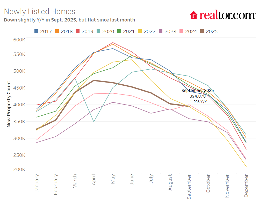
On an annual basis, newly listed homes increased in the Northeast and Midwest in September, while falling in the South and West:
- Northeast: +1.3%
- Midwest: +2.4%
- South: -3.5%
- West: -0.1%
Metros with the strongest growth in newly listed homes over the past year were:
- Indianapolis (10.6%)
- Charlotte (+9.7%)
- Detroit (+8.0%)
Pending sales remain weak
Total listing counts, which includes both homes for sale and those under contract, posted a 13.0% year-over-year increase, maintaining its 22-month streak, but remaining slightly down since June.
While inventory was up, buyer activity was more subdued. Pending home sales—listings under contract—were flat year-over-year, the first non-negative reading of 2025.
Click here for pending sales figures in Appendix
Back to top
In September, the typical home spent 62 days on the market, which is 7 days longer than the same time last year. This marks the 18th straight month of homes taking longer to sell on a year-over-year basis, and the 4th month with time on market back in line with 2017-2019 norms.

Regional and metro trends: Time on the market keeps on ticking
All four regions saw year-over-year increases in time on market, reflecting broader cooling trends:
- West: +10 days
- South: +8 days
- Midwest: +3 days
- Northeast: +1 days
Relative to pre-pandemic norms, only the West is seeing slower sales:
- West: 10 days slower
- South: 3 days faster
- Midwest: 13 days faster
- Northeast: 22 days faster
Among the 50 largest U.S. metro areas, 45 saw homes linger longer than last year, about the same as the past two months. The exceptions are Kansas City, Buffalo, and Minneapolis (all are seeing homes move 1 day faster), with Baltimore and Philadelphia showing no change since last September. Longer time on market remains a key contributor to the widespread year-over-year increases in active inventory. The biggest slowdowns in time on market were seen in:
- Miami (+16 days)
- Orlando (+14 days)
- Riverside (+13 days)
- Las Vegas (+13 days)
- Tampa (+13 days)
Now 24 of the top 50 markets are seeing listings sit longer than their pre-pandemic averages, almost all of which are in the South and West – another indication of the geographic divergence in housing market conditions.
List prices remain flat nationally, but fall slightly in the South and West
In September, the national median list price was $425,000, unchanged from last year and down 1.2% since last month, a seasonally typical trend. Price per square foot—a gauge of home values that accounts for the size of homes on the market—also fell slightly (down 0.3% YoY and -0.8% MoM).
Since September 2019, the typical list price has climbed 36.0%, while price per square foot is up 50.6%. These long-term increases have significantly affected affordability even before the impact of higher mortgage rates is considered. Most of these increase is a holdover from gains during the pandemic era. Since September 2022, the national median list price is down -0.6%, while price per square foot is up 2.8% – despite an 50.4% increase in inventory and the median home staying on market for 15 days longer.
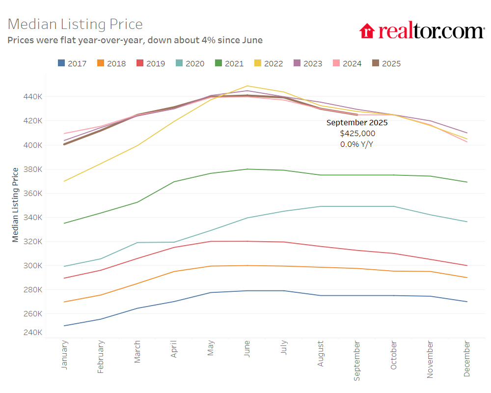
Regional List Price Patterns: Overall vs. Per Square Foot
Year-over-year changes in median list prices by region were:
- Northeast: -0.4%
- Midwest: +0.0%
- South: -0.4%
- West: -3.6%
When adjusting for changing home sizes, price per square foot tells a story of more pronounced regional differences, with prices rising more robustly in the Northeast especially:
- Northeast: +3.1%
- Midwest: +1.2%
- South: -1.2%
- West: -1.6%
Price cuts remain elevated
Turning back to the national picture, price cuts continue to be a key feature of the 2025 market, even if median list prices have shown little movement overall. In September, 19.9% of home listings had price reductions—up a modest 1.2 percentage points from last year, and down slightly since last month.
Price reductions in September have begun to show some more variation by region, with the Northeast standing out with far fewer price cuts. The Northeast continues to distance itself from the Midwest and other regions this month, especially on key metrics like price changes, new listing growth, and price reductions. More limited new construction in the Northeast is likely a factor.
- Northeast: 14.0% of listings
- Midwest: 19.2%
- South: 21.1%
- West: 20.9%

Back to top
New this month, we try to quantify how buyer-friendly a market is by examining months of supply. The National Association of Realtors® publishes nationwide months of supply each month with its existing-home sales report. For the first time, Realtor.com is releasing its own months of supply measure that localizes this key market balance metric for the top 50 U.S. metros.
First, looking at the national figures, price cuts are far more common at lower price tiers. Nationwide, over 20% of listings under $350,000 had a price cut in September compared to just 13.3% of listings over $1 million. This is consistent with more motivated sellers at the bottom of the housing ladder, who need to sell in order to buy their next home, compared to patient and/or price-anchored sellers at the top. This also speaks to regional patterns, where higher-price Northeast markets are also the strongest right now. As an example of the regional divergence, the table below also shows listings with a reduction by price tier for Portland, OR, the market with the 2nd most price cuts in September 2025, and Hartford, CT, the market with the 2nd fewest price cuts. Portland follows the national trend with price cuts far more common at the bottom of the market. In Hartford – a much hotter housing market – price cuts don’t vary nearly as significantly by tier, and, if anything, are slightly more common at the top of the market.
| Nationwide | Portland, OR |
Hartford, CT |
||||||
|
Share of Listings |
Share with a Price Cut | Share of Listings | Share with a Price Cut | Share of Listings |
Share with a Price Cut |
|||
| Under $350k |
39.8% |
20.8% | 10.8% | 34.2% | 37.7% |
10.9% |
||
| $350k-$500k |
22.2% |
21.6% | 24.9% | 31.7% | 27.5% |
9.3% |
||
| $500k-$750k |
18.3% |
21.1% | 34.5% | 32.1% | 20.3% |
11.8% |
||
| $750k-$1M |
8.1% |
18.3% | 15.9% | 27.1% | 7.9% |
11.7% |
||
| Over $1M |
11.5% |
13.3% | 13.9% | 23.6% | 6.6% |
11.6% |
||
| Overall: |
19.9% |
30.2% |
11.0% |
|||||
Price cuts in buyer’s markets
The bar charts below plot the share of price cuts by tier in each of the 7 buyer’s markets, according to our metro market balance analysis in the August 2025 housing market trends report. Even in buyer’s markets, price cuts tend to be least common at the top of the market, meaning that home shoppers at middle or lower price tiers seem to be gaining more leverage in such markets than those shopping at the luxury end. A second observation is that there’s no one-size-fits-all pattern across markets. Price reductions in Austin are highest in the middle $500k-$750k segment (32%); in Orlando, the rate of price cuts is almost uniform; in Jacksonville, there’s considerably more softness in the bottom 3 tiers than the top 2. Meanwhile, New York and Miami stand out as idiosyncratic outliers. Despite high months of supply in these markets, price cuts are rather uncommon, suggesting sellers in these markets are either exceptionally patient or particularly price-anchored.
September 2025 Regional Statistics
|
Region |
Active Listing Count YoY | New Listing Count, YoY | Median List Price | Median List Price, YoY | Median List Price Per SF, YoY | Median Days on Market, YoY (Days) | Price Reduced Share | Price-Reduced Share, YoY (Percentage Points) |
|
Northeast |
10.1% | 1.3% | $525,000 | -0.4% | 3.1% | 1 | 14.0% | 0.6 |
|
Midwest |
13.2% | 2.4% | $319,950 | 0.0% | 1.2% | 3 | 19.2% | 1.1 |
| South | 17.9% | -3.5% | $388,500 | -0.4% | -1.2% | 8 | 21.1% |
1.2 |
| West | 21.1% | -0.1% | $600,000 | -3.6% | -1.6% | 10 | 20.9% |
1 |
| National Average | 17.0% | -1.2% | $425,000 | 0.0% | -0.3% | 7 | 19.9% |
1.2 |
September 2025 Housing Overview of the 50 Largest Metros
| Metro | Active Listing Count, YoY | New Listing Count, YoY | Median List Price | Median List Price, YoY | Median List Price Per SF, YoY | Median Days on Market, Y-Y (Days) | Price Reduced Share | Price Reduced Share, Y-Y (Pct. Points) |
| Atlanta-Sandy Springs-Roswell, GA | 19.1% | -4.4% | $415,000 | 0.0% | -1.6% | 10 | 23.8% | 2.2 |
| Austin-Round Rock-San Marcos, TX | 11.2% | -1.7% | $495,000 | -4.8% | -4.3% | 7 | 27.6% | 1.7 |
| Baltimore-Columbia-Towson, MD | 38.6% | -3.1% | $385,000 | 4.1% | 2.6% | 0 | 19.8% | 3.3 |
| Birmingham, AL | 11.8% | 7.8% | $299,900 | 0.0% | 1.0% | 3 | 18.7% | 0.2 |
| Boston-Cambridge-Newton, MA-NH | 21.5% | 6.1% | $812,000 | -3.3% | 1.8% | 5 | 18.5% | 2.2 |
| Buffalo-Cheektowaga, NY | 10.5% | 2.1% | $275,725 | -0.6% | 3.8% | -1 | 11.1% | 0.9 |
| Charlotte-Concord-Gastonia, NC-SC | 36.0% | 9.7% | $438,500 | 2.0% | -0.5% | 10 | 25.5% | 2.6 |
| Chicago-Naperville-Elgin, IL-IN | 0.6% | -2.0% | $372,366 | -2.0% | -0.2% | 2 | 16.4% | 0.9 |
| Cincinnati, OH-KY-IN | 15.7% | 7.4% | $344,061 | 2.0% | 2.4% | 2 | 19.4% | 1.5 |
| Cleveland, OH | 14.9% | 7.5% | $259,950 | 0.0% | 2.6% | 4 | 18.3% | 1.1 |
| Columbus, OH | 23.7% | -2.8% | $375,000 | -0.6% | -0.5% | 9 | 28.0% | 3 |
| Dallas-Fort Worth-Arlington, TX | 16.7% | -2.2% | $425,000 | -3.3% | -1.4% | 11 | 27.4% | 0.2 |
| Denver-Aurora-Centennial, CO | 22.0% | -6.2% | $599,450 | -1.8% | -3.9% | 10 | 30.7% | 2.5 |
| Detroit-Warren-Dearborn, MI | 19.5% | 8.0% | $275,000 | -0.7% | -1.8% | 1 | 18.6% | 2.3 |
| Grand Rapids-Wyoming-Kentwood, MI | 1.5% | -0.9% | $397,950 | 2.1% | 5.8% | 2 | 20.0% | 0 |
| Hartford-West Hartford-East Hartford, CT | 7.1% | -1.4% | $444,450 | 4.6% | -0.7% | 3 | 11.0% | 0.5 |
| Houston-Pasadena-The Woodlands, TX | 25.1% | -3.8% | $359,950 | -2.7% | -1.7% | 8 | 19.6% | 0.5 |
| Indianapolis-Carmel-Greenwood, IN | 25.3% | 10.6% | $323,250 | -0.5% | 0.2% | 3 | 29.7% | 3.8 |
| Jacksonville, FL | 5.9% | -7.5% | $394,500 | -1.1% | -2.5% | 10 | 26.0% | 0.2 |
| Kansas City, MO-KS | 23.2% | 1.6% | $387,450 | -0.5% | 1.3% | -1 | 18.9% | 1.5 |
| Las Vegas-Henderson-North Las Vegas, NV | 40.8% | -3.0% | $475,000 | -0.5% | -0.9% | 13 | 23.2% | 0.9 |
| Los Angeles-Long Beach-Anaheim, CA | 24.0% | -7.4% | $1,099,000 | -4.8% | -1.9% | 11 | 15.2% | 1.5 |
| Louisville/Jefferson County, KY-IN | 22.8% | 3.7% | $317,000 | -0.8% | 2.5% | 2 | 21.9% | 1.7 |
| Memphis, TN-MS-AR | 15.4% | -3.8% | $328,125 | -2.3% | 1.5% | 4 | 23.9% | 1.3 |
| Miami-Fort Lauderdale-West Palm Beach, FL | 16.3% | -8.2% | $499,900 | -4.8% | -3.4% | 16 | 16.2% | -0.8 |
| Milwaukee-Waukesha, WI | 3.7% | 4.2% | $399,000 | 2.3% | 6.3% | 2 | 16.9% | -1.5 |
| Minneapolis-St. Paul-Bloomington, MN-WI | 5.0% | 1.8% | $425,000 | -1.7% | -0.5% | -1 | 18.9% | 1.8 |
| Nashville-Davidson–Murfreesboro–Franklin, TN | 19.8% | N/A | $539,450 | -1.1% | -0.3% | 7 | 22.1% | 4.4 |
| New York-Newark-Jersey City, NY-NJ | 3.2% | 5.1% | $759,500 | -1.7% | -4.7% | 1 | 9.1% | -0.2 |
| Oklahoma City, OK | 18.3% | -0.4% | $320,000 | 1.6% | -0.1% | 7 | 23.7% | -0.5 |
| Orlando-Kissimmee-Sanford, FL | 12.8% | -6.9% | $420,500 | -2.2% | -2.7% | 14 | 22.9% | -0.4 |
| Philadelphia-Camden-Wilmington, PA-NJ-DE-MD | 15.5% | -0.9% | $384,900 | 1.4% | 0.9% | 0 | 17.3% | 1.8 |
| Phoenix-Mesa-Chandler, AZ | 23.0% | -0.5% | $499,000 | -4.0% | -1.8% | 9 | 26.5% | 0.5 |
| Pittsburgh, PA | 9.8% | 2.4% | $254,950 | 6.3% | 4.3% | 2 | 21.6% | 1.9 |
| Portland-Vancouver-Hillsboro, OR-WA | 16.3% | -6.9% | $599,000 | -1.0% | -2.0% | 9 | 30.2% | 3 |
| Providence-Warwick, RI-MA | 13.4% | 0.8% | $594,725 | 4.8% | 3.2% | 1 | 13.6% | -3.7 |
| Raleigh-Cary, NC | 34.3% | -4.9% | $457,662 | 0.6% | -1.1% | 8 | 24.5% | 5.1 |
| Richmond, VA | 22.0% | 7.8% | $429,970 | -2.8% | 0.9% | 2 | 17.3% | 2.7 |
| Riverside-San Bernardino-Ontario, CA | 19.6% | -5.8% | $595,000 | -0.7% | -1.3% | 13 | 17.0% | 1.4 |
| Sacramento-Roseville-Folsom, CA | 18.2% | -7.3% | $615,745 | -3.0% | -2.1% | 12 | 22.1% | 2 |
| St. Louis, MO-IL | 12.6% | 0.4% | $299,900 | 0.0% | -0.4% | 1 | 18.7% | 2.1 |
| San Antonio-New Braunfels, TX | 16.4% | -2.1% | $330,000 | -2.9% | -3.1% | 6 | 27.2% | 2.3 |
| San Diego-Chula Vista-Carlsbad, CA | 25.6% | -6.6% | $948,500 | -4.9% | -3.2% | 9 | 19.7% | 1.3 |
| San Francisco-Oakland-Fremont, CA | 6.8% | -2.6% | $975,000 | -2.3% | -4.0% | 8 | 12.8% | -0.8 |
| San Jose-Sunnyvale-Santa Clara, CA | 12.5% | -2.6% | $1,365,750 | -4.6% | -5.4% | 5 | 11.7% | 0.4 |
| Seattle-Tacoma-Bellevue, WA | 27.0% | 0.4% | $769,000 | -0.4% | -0.7% | 4 | 20.5% | 3.2 |
| Tampa-St. Petersburg-Clearwater, FL | 12.2% | -8.0% | $412,450 | -0.6% | -1.2% | 13 | 26.8% | -1.4 |
| Tucson, AZ | 22.3% | 1.0 |